Form Control Types Documentation
This Documentation describes various Form Control Types with detailed examples of their structure and usage in JSON format. These can be used for building forms dynamically with different controls, depending on the input needed.
1. BOOLEAN_FIELD
1.1 Description
A control used to represent a boolean value (true/false).
1.2 Use Case
Use this control for toggling features, such as enabling or disabling a schedule.
{
  "fieldId": "expired",
  "label": "Expired",
  "description": "Please confirm the expiration status",
  "required": false,
  "default": true,
  "dataType": "boolean",
  "hidden": false,
  "editable": true,
  "controlType": "BOOLEAN_FIELD"
}

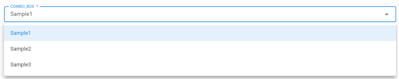
2. COMBO_BOX
2.1 Description
A dropdown control allowing users to select from predefined options or values fetched from a stream.
2.2 Use Case
Use this control to display a list of options, either inline or dynamically loaded via pstream.
Note
lovSourceType:
- Accepted values:
inline(default) orpstream.
lovSourceParams:
-
Required if lovSourceType is not inline.
-
name: Name of the pstream - Required.
-
valueColumn: Column which contains the lov identifier - Required.
-
labelColumn: Column which contains the lov displayName - Optional.
-
query: cfxql query to filter the pstream - Optional.
-
max_rows: Maximum number of values to retrieve. (Default is 100) - Optional.
lovValues:
-
Values given in
lovValueswill be appended to the results coming from the pstream above. -
If the same identifier is found in both
pstreamandlovValues, the identifier given inlovValuestakes precedence.
{
  "help": "Status",
  "dataType": "string",
  "controlType": "COMBO_BOX",
  "required": true,
  "editable": true,
  "label": "Status",
  "hidden": false,
  "fieldId": "city",
  "lovSourceType": "pstream",
  "lovSourceParams": {
    "name": "main",
    "valueColumn": "city",
    "labelColumn": "city",
    "query": "city contains 'hyderabad'"
  },
  "lovValues": [
    {
      "identifier": "sample1",
      "displayName": "Sample1"
    },
    {
      "identifier": "Sample2",
      "displayName": "Sample2"
    },
    {
      "identifier": "Sample3",
      "displayName": "Sample3"
    }
  ]
}
3. RADIO_BUTTON
3.1 Description
A set of radio buttons for single selection among predefined options.
3.2 Use Case
Useful when the user needs to select one option from a small list of predefined choices.
{
  "fieldId": "inputFieldId",
  "label": "Input Field",
  "help": "Input Field",
  "dataType": "string",
  "hidden": false,
  "editable": true,
  "required": true,
  "lovValues": [
    {
      "identifier": "device1",
      "displayName": "Device 1"
    },
    {
      "identifier": "device2",
      "displayName": "Device 2"
    },
    {
      "identifier": "device3",
      "displayName": "Device 3"
    }
  ],
  "controlType": "RADIO_BUTTON"
}

4. TEXT_FIELD
4.1 Description
A simple text input field.
4.2 Use Case
Used when textual information needs to be input, such as IP addresses or user information.
{
  "fieldId": "ip_address",
  "label": "Please Add the device IP",
  "help": "Please Add the device IP",
  "dataType": "string",
  "controlType": "TEXT_FIELD",
  "hidden": false,
  "editable": true,
  "required": false
}

{
  "fieldId": "newPassword",
  "label": "New Password",
  "help": "New Password of User",
  "dataType": "string",
  "controlType": "TEXT_FIELD",
  "controlPropertyList": [
    {
      "attribute": "input-type",
      "value": "password"
    },
    {
      "attribute": "layout-group-id",
      "value": "newPassword"
    },
    {
      "attribute": "layout-percent",
      "value": "100"
    }
  ],
  "hidden": false,
  "editable": true,
  "required": true
}

{
  "fieldId": "device_ip",
  "label": "Please Add the device IP if not below",
  "help": "Please Add the device IP if not below",
  "dataType": "string",
  "controlType": "TEXT_FIELD",
  "defaultValue": "10.11.123.123",
  "hidden": false,
  "editable": true,
  "required": false
}

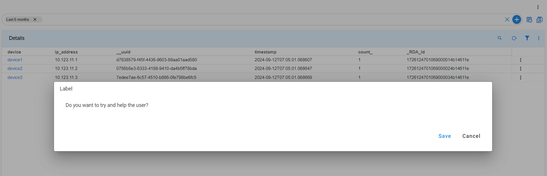
5. LABEL
5.1 Description
le label for displaying static information.
5.2 Use Case
Use this when you need to display static information to users without requiring input.
{
  "help": "Do you want to try and help the user",
  "dataType": "string",
  "controlType": "LABEL",
  "required": false,
  "editable": false,
  "label": "Do you want to try and help the user",
  "hidden": false,
  "fieldId": "monitor"
}
6. FILE_UPLOAD
6.1 Description
A control used to upload files.
6.2 Use Case
Use this control when users need to upload files to the system.
{
  "help": "Choose file to upload",
  "dataType": "string",
  "required": true,
  "editable": true,
  "label": "Choose file to upload",
  "controlType": "FILE_UPLOAD",
  "hidden": false,
  "fieldId": "fileUpload"
}

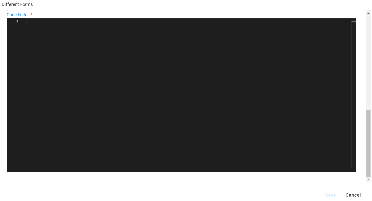
7. PYTHON_EDITOR
7.1 Description
A code editor for writing Python or other programming languages.
7.2 Use Case
Use this control for inputting rules, scripts, or configuration files.
{
  "fieldId": "pythonFieldId",
  "label": "Code Editor",
  "description": "Code Editor",
  "required": true,
  "isSecret": false,
  "dataType": "string",
  "hidden": false,
  "editable": true,
  "controlType": "PYTHON_EDITOR",
  "controlPropertyList": [
    {
      "attribute": "lang",
      "value": "json"
    }
  ]
}
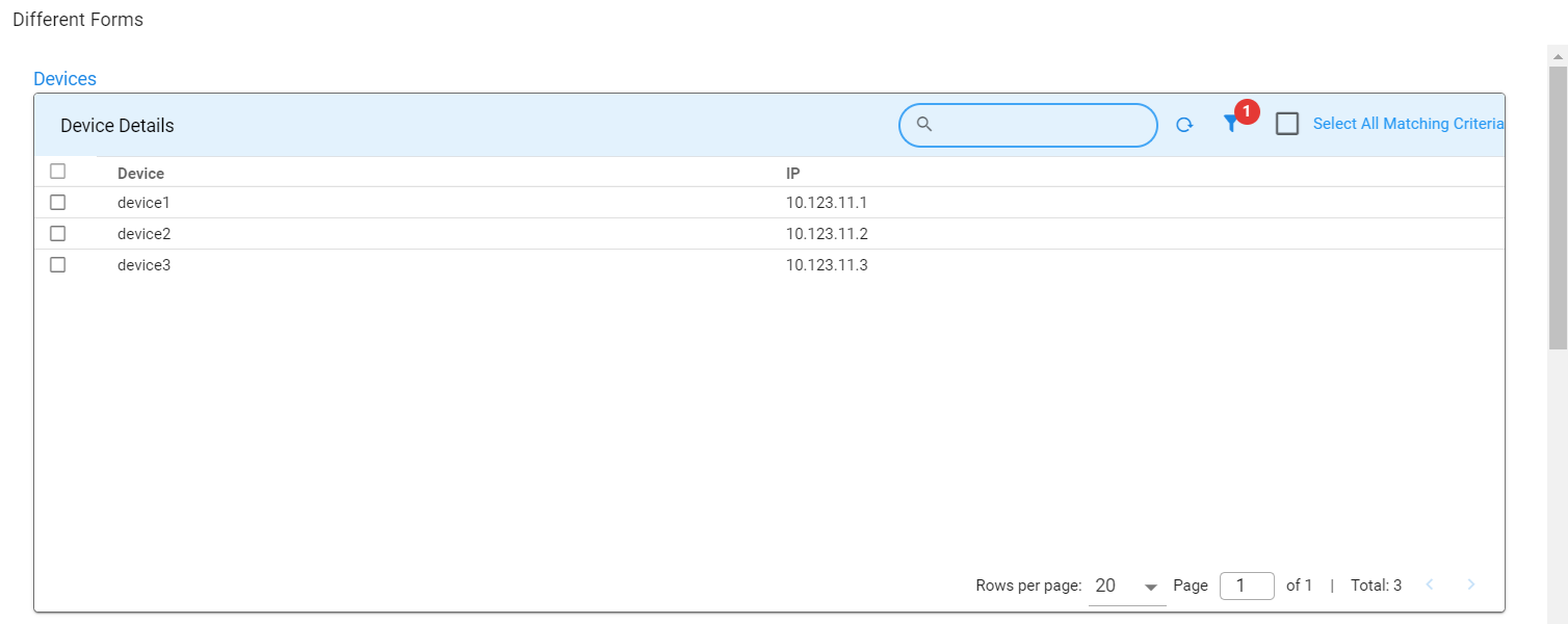
8. SELECTOR_TABLE
8.1 Description
A control displaying a table, allowing users to select one or more rows.
8.2 Use Case
Useful for selecting records from a list of options shown in a table format.
{
  "help": "Devices",
  "dataType": "string",
  "required": false,
  "editable": true,
  "label": "Devices",
  "hidden": false,
  "fieldId": "Others",
  "controlType": "SELECTOR_TABLE",
  "controlPropertyList": [
    {
      "attribute": "column-key",
      "value": "device"
    },
    {
      "attribute": "selection",
      "value": "MULTIPLE"
    }
  ],
  "widget": {
    "title": "Device Details",
    "timebased": false,
    "max_width": 12,
    "height": 8,
    "min_width": 12,
    "extra_filter": "deviceSupports contains 'ipV4'",
    "stream": "device",
    "ts_column": "timestamp",
    "sorting": [],
    "columns": {
      "device": {
        "title": "Device",
        "key": true
      },
      "ip_address": {
        "title": "IP"
      }
    }
  }
}
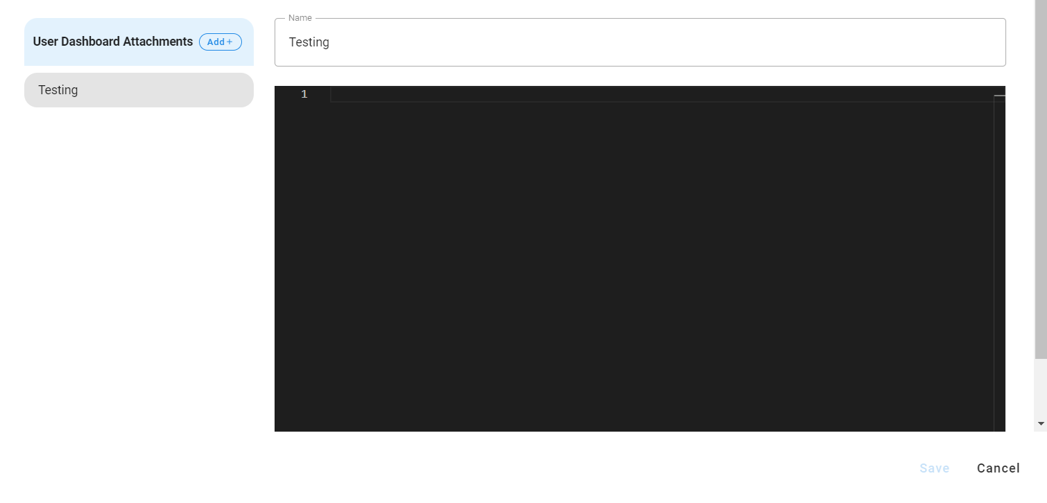
9. JSON_PROP_FIELD
9.1 Description
The JSON_PROP_FIELD control is used to create or edit JSON properties, especially useful when handling long text strings like HTML templates. This control allows users to input structured data in JSON format, making it ideal for scenarios where properties need to be flexible and editable in a key-value format.
9.2 Use Case
This control type is particularly helpful when dealing with complex data structures or properties that involve large text blocks, such as configurations, templates, or settings that are represented in JSON. For instance, it can be used to manage HTML templates or other text-heavy content in a structured format.
{
  "fieldId": "json_test",
  "label": "User Dashboard Attachments",
  "description": "User Dashboard Attachments",
  "required": true,
  "isSecret": false,
  "dataType": "string",
  "hidden": false,
  "editable": true,
  "controlType": "JSON_PROP_FIELD",
  "controlPropertyList": [
    {
      "attribute": "layout-field-group-title",
      "value": "Testing Editor"
    }
  ]
}